Firstly let me thank the girls (women) at Intuitive Interior Design for giving me the opportunity to create their brand identity.
Logo design for me, The AD Man, is not about looking for a symbol on the 'interweb :-)' and then just applying a name to it.
It's all about exploration of the concepts and the meaningfulness my clients want to introduce to the world.
This was one of those great opportunities.
As always it was a fantastic brief and the learning experience of researching the truths behind the word 'intuitive' and how that fits with the brand personality they want to portray.
So, with that great foundation I set to work and started my journey of discovery and education.
Here, I'm sharing with you the design process that lead to the beautiful and meaningful logo.
Exploration
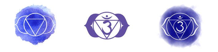
INTUITION AND THE THIRD EYE CHAKRA
Looking at images of the ‘Brow’ or ‘3rd Eye’ Chakra we find the mandala/symbol is representative of an eye.
Interestingly the shape representing ‘balance’, the triangle, is inverted, not pointing upward like a pyramid.
The mandala often appears with the numeral 3 as well as an upside-down eye symbol.
Those two elements combine to create what we know as the ‘Om’ symbol,
‘Ooouuummm’ being a chant used to open the 3rd eye.

The 'eye' and the ‘all-seeing-eye’ are also found in many other culturally significant items and objects including on the US$1 Bill.
The ‘Eye Of Horus’ is specific to Egyptian culture and so communicates Egyptology specifically.
Creation

CREATING THE 'INTUITION' SYMBOL
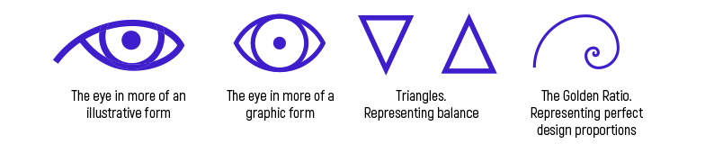
So from there the design challenge was to create a symbol/icon which represents the spiritual side of intuition.
Specifically using the 3rd eye chakra and drawing on inspiration from other symbolism.
These are the basic elements used in the designs on the following pages.
Note: Typography of the name Intuitive Interior Design follows once the preferred symbol has been selected.
Colour Selection and Psychology:
Slightly Muted Blue-Purple
Represents: Creativity / Intuition / Wisdom
Evolution
Option One
The 3rd Eye
This design combines the illustrative ‘eye’ paying symbolic yet more graphic homage to the chakra symbol, including balance represented by the triangular ‘pupil’.
Option Two
Universal Inspiration
This design combines the more graphic representations of the elements in a beautifully balanced symmetrical logo.
Looking closely we can see the 3rd eye chakra, with the triangle now more dominant and it is inverted to represent ‘upward focus’ drawing energy and inspiration from the universe.
Option Three
Inner Inspiration
This design also combines the more graphic representations of the elements in a beautifully balanced symmetrical logo.
This time the triangle, still dominant is downward-facing to represent ‘inner focus’ drawing energy and inspiration from within.
Truly more divine because your strength comes from within.
The ‘Golden Ratio Spiral’ is included to represent the design perfection the girls will deliver to their clients.
Further Evolution
Now, with a little more thought and application to various media, The AD Man and the client 'Intuitive Interior Design' further explored colour options. Especially how to make the logo and branding a step up from where it was.
So we decided to make the logo 'Gold'.
Represented here as a 'printable colour gradation' we also produce the logo in a 'raised metallic' finish on business cards and the like.
All this has added the extra "WOW' factor businesses really need so they stand out.
Typography
With more than 11,000 (YES! Eleven Thousand) fonts in The AD Man's quiver, he has the ability to select fonts with nuances and subtle variations that are best suited to conveying the mood and manner of the brand.
Although that seems daunting, The AD Man knows his typography and knows his font library intimately.
So the choices are narrowed down. Then the final selection is made and agreed on.
Finalisation
The final logos.
In the final analysis we explored the idea of making the logo a little more 'human'.
So with the addition of a watercolour patch as a background to the logo, it help make the brand more approachable and friendly.
A little more 'hip' if you will. Softer. More personable. Yet still retaining the core values of 'intuition'